Spreadsheet tools as Microsoft Excel, Google Spreadsheet, Apache OpenOffice Calc (see other alternatives in maketecheasier) could be considered as a basic or introductory tool for data analysis.
In this post, we are going to focus on the tool MS Excel 2016 as a basic introduction to several of its more interesting functionalities for data analysis (in a similar way found in the other spreadsheet tools). In later entries of the Project section, practical examples developed with these features will be shown.
Introduction
MS Excel is probably the most used tool for data analysis and visualization in the business and education field.
Below, we will see how to use this tool to perform descriptive statistics analysis, as well as more advanced analysis with the novelties of the Excel data model and focusing mainly on the use of pivot tables and charts.
The information presented here is based on a small part of all the aspects covered in the courses of the Microsoft Data Science Program:
- Essential Statistics for Data Analysis using Excel: Excel for descriptive statictics analysis.
- Analyzing and Visualizing Data with Excel: Excel for different data models analysis and visualization.
Descriptive statistics analysis
Using formulas
As an initial exploratory analysis of the values of a variable, and according to the descriptive statistics post, with MS Excel you can easily calculate the measures of central tendency and variability by applying the corresponding formulas:
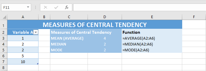
Measures of Central tendency
The calculation of the measures of central tendency is carried out with the following formulas applied on all the values of the variable under analysis:
| Masure | Excel function |
|---|---|
| Average | AVERAGE() |
| Median | MEDIAN() |
| Mode | MODE() |
Example:
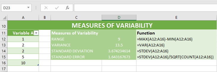
Measures of variability
The calculation of the measures of variability is carried out with the following formulas applied on all the values of the variable under analysis:
| Measure | Excel function |
|---|---|
| Range | MAX()-MIN() |
| Variance | VAR() |
| Standard Deviation | STDEV() |
| Standard Error | STDEV()/SQRT(COUNT()) |
Example:
Analysis ToolPak
MS Excel has the Add-in “Analysis ToolPak” which is very useful for statistical calculations in a quick and easy way.
Once activated this Add-in following the indications in the previous link, you can use it in the Data tab as it is indicated in dummies.com - How to use Excel’s Descriptive Statistics Tool.
Example - Summary of descriptive statistics using the Analysis ToolPak:
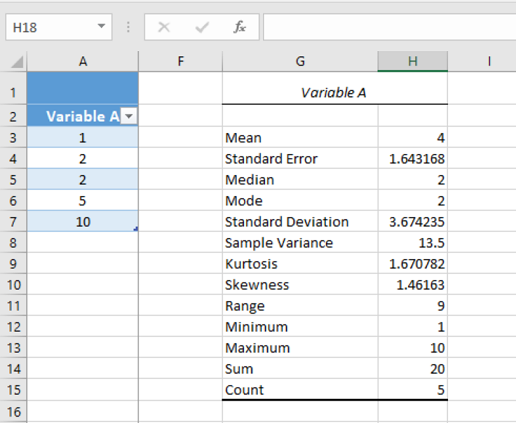
As we can see, all measures of central tendency and variability are automatically obtained. As well as, some other measures such as the minimum and maximum values of the sample, the sum of all their values, the sample count, and the values of Kurtosis and asymmetry, which serve to measure the shape of a probability distribution and their skewness and asymmetry, as we will see in the post about distribution visualizations.
Data model in Excel
The Excel data model started in the MS Excel 2010 version using the Power Query add-in and has been directly integrated into Excel in the MS Excel 2016 version. The data model allows to establish a relational model between different tables and to explore and analyze your data through pivot tables and graphs. This model supposes 3 great advantages with respect to the traditional management of tables relation based on the use of the formula VLOOKUP():
- Speed: related data updates from different tables using VLOOKUP() can be very slow since a search calculation is executed for each of the cells in our tables.
- Data manipulation: When analyzing the data, it is very likely to require operations of data manipulation, which is not easy to perform with VLOOKUP() relationships.
- Scale: The maximum size of Excel is 1 million cells (which is unmanageable with VLOOKUP() relationships due to its slowness). However, this new data model allows working with orders of magnitude of several million.
Importing data
The main advantage of performing external connections for the data import is the direct data update in Excel when a change occurs in the data source, instead of having to copy and paste all the data in an Excel sheet to the time to work with these.
In Excel, the import of external data can be done directly in Excel, or from Power Pivot tab, or from the Power Query add-in integrated in the Excel tools bar in the MS Excel 2016 and which, besides, has data cleaning and data transformation functions. In the following link The White Pages - Using Excel With External Data – What’s the Right Tool? you can consult a detailed comparative among these options in order to choose the right tool for you.
More info about the possibilities of data transformation in Power Query:
Pivot tables and Pivot charts
Pivot Tables and Pivot Charts in MS Excel are a way to analyze large volumes of data in a simple and interactive way. This tool, which is available from the MS Excel 2007 version, is especially interesting in the latest versions where you can do more advanced analysis and visualizations depending on the types of data used.
Pivot tables consist of a way to quickly analyze the data presented in a table with a matrix summary of the required information or measures.
The pivot charts represent visually the data information of a table. As you can see in the video of the link, the creation of these charts is also similar to the creation of a pivot table.
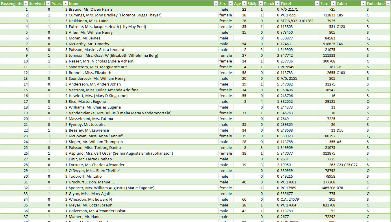
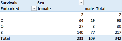
Example Titanic train.csv dataset:
Next, we are going to represent an example of pivot table and pivot chart of the data collected in train.csv
Pivot table example
using a pivot table we are going to visualize the number of survivals by embarked (variable in rows) and by gender (variable in columns):
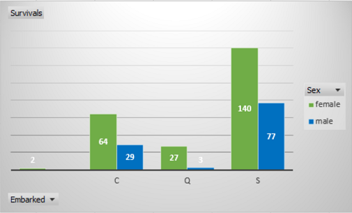
Pivot Chart example
In the same way we can visualize a pivot chart of the same data of survivals by emabarked (variable in rows) and by gender (variable in columns):
Power Pivot
Power Pivot is an Excel add-in that provides advanced features to perform data analysis and create sophisticated data models. Power Pivot, can integrate large volumes of data from various sources, perform information analysis quickly and share all this information.
Both Excel and Power Pivot can create data models as a collection of tables with relationships. The great difference between both is that Power Pivot allows to create more sophisticated data models and carry out more advanced analysis.
DAX
Data Analysis Expressions (DAX) is a data analysis language that consists of formulas and expressions for the calculation of measurements from tabulated data in the Microsoft Power Pivot, Power BI Desktop and SQL Server Analysis Services (SSAS) tools.
With this language you can define Calculated Columns and Measures which will be calculated dynamically in our pivot tables according to the context defined through the columns, rows, filters or slicers selected.
In DAX the functions or formulas refer to a column or a complete table, and filters can be added to collect specific values.
More info on DAX:
- The DAX Resource Center Wiki
- Data analysis expressions reference (DAX)
- DAX in the BI Tabular Model Whitepaper and Samples
Power BI Compatibility
Power BI is a Microsoft service of business analysis tools. Through this tool, you can create collaborative and customized insights and visual reports with different levels of accessibility. These insights are available online and they can be embed in your app or website. Its objective is to provide analytical information of value for the company in a simplified and very visual way to speed up decision makingm actions.
The Excel compatibility with Power BI can be done in two different ways:
- Direct import of the fundamentals model: The data model is imported into Power BI and the original data model is worked independently in Excel.
- Connection, Management and Visualization of Excel in Power BI: It is possible to work on the original data model by means of the Excel Online function of Power BI that allows to work in Excel on a browser and we will visualize the pivot charts generated in Excel originally on this model of data.
Sources of interest:
- Course “Essential Statistics for Data Analysis using Excel” as part of the Microsoft Data Science Program
- Course “Analyzing and Visualizing Data with Excel” as part of the Microsoft Data Science Program
- maketecheasier – maketecheasier
- Support Microsoft - Use the Analysis ToolPak to perform complex data analysis
- Dummies.com - How to use Excel’s Descriptive Statistics Tool
- Support Microsoft - VLOOKUP function
- Support Microsoft - Connect to (Import) external data
- Support Microsoft - Get data using the Power Pivot add-in
- Support Microsoft - Import data from external data sources (Power Query)
- The White Pages - Using Excel With External Data – What’s the Right Tool?
- Support Microsoft - Shape data (Power Query)
- Support Microsoft - Overview of PivotTables and PivotCharts
- Support Microsoft - Get started with Power Pivot in Microsoft Excel
- Support Microsoft - Power Pivot: Powerful data analysis and data modeling in Excel
- Support Microsoft - Calculated Columns in Power Pivot
- Support Microsoft - Measures in Power Pivot
- Social TechNet Microsoft - DAX Resource Center
- MSDN Microsoft - Data analysis expressions reference (DAX)
- Microsoft.com - DAX in the BI Tabular Model Whitepaper and Samples
- PowerBI Official website - powerbi.microsoft.com
- Microsoft.com - Get data from Excel workbook files